Denzel ArthurDenzel Arthurcgidoggs
Color Spaces for Computer Graphics
Ever since Taran Van Hemert uploaded this video, a quiet yet malignant bug latched onto my brain. Six years later, upon completing a postgraduate program focused on procedural visual effects, this bug began to entice me once more—compelling me to learn more about colorspaces and general post processing. As a primarily digital bedroom artist, I rarely need to understand such nuances, I simply accept my render as is and move on. With my primary editing tool of choice being Premiere Pro, which as far as I am concerned, gave no option to investigate the colorspace of an image, nor work with image sequences of a high dynamic range. To circumvent this, I started a personal project that allowed me to investigate my workflow from the ground up. I changed and implemented new approaches to rendering and editing, giving me a stronger understanding and appreciation for color science within computer graphics. This documentation of my process is to serve as a check point for what I have learned about colorspaces and post processing. Although there is a lot of documentation online about the technicality of chromaticity and luminosity, there are few texts, and videos for that matter, that document a truly universal approach to working with linear images on a gamma encoded display for digital artists. Therefore I also hope this document serves as a software-agnostic guide to working with color, no matter your software of choice, so long as you are able to control your scene and display colorspace, more on this later.
Upon returning to my PC after an arduous year of trials and tribulations—I will spare you the spicy details—I set off to work on a personal project that led me to put the same care and attention that my favourite pieces of media receive, in terms of color accuracy anyway. What seemed like an overly complicated task, hindering me from interacting with what really mattered (the subject of the image) became the focal point of my exploration (the image itself). Although I initially supposed that the final output didn't really matter, I began sketching a mountainous region in which a cloaked protagonist knelt at its base (this has a lot to do with my arduous journey to my PC). In this specific case, desecrated by my tribulations, my rough sketch was to be more or less discarded for the pure exploration that is light and color. The original sketch had a lot of extra detailing that would take extra time to implement, time I would much rather spend in Davinci Resolve, the new tool in my workflow. With my scope realized, I began the process of building a mountainous region in Houdini whilst grabbing references to keep this pure exploration of the image, fluff with some amount of esotericism.
Terrain Generation
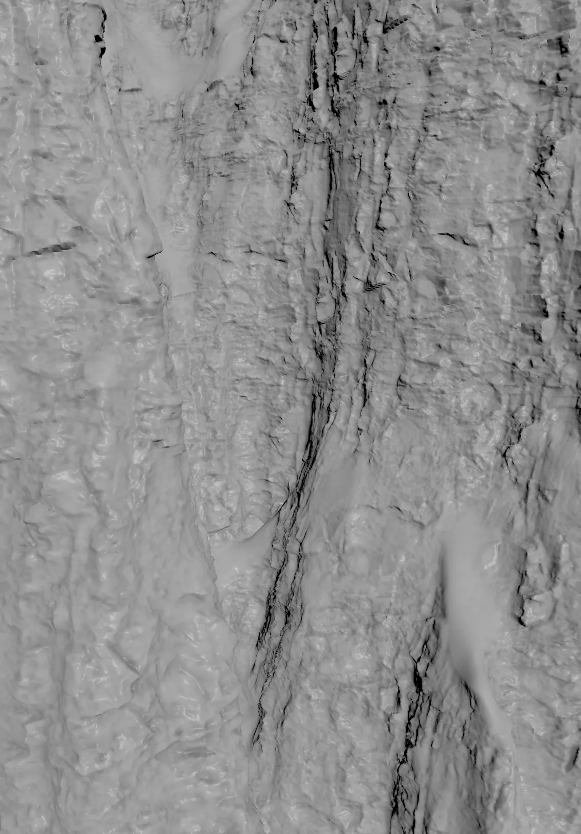
The Houdini part of this project was relatively smooth, as I have slowly but surely become more accustomed to the program. The geometry spreadsheet is no longer the equivalent of running random text within a terminal to impress onlookers. It is actually integral to comprehending where the data I wish to manipulate lives, and so on. The initial terrain shape was quickly realized using primitives before involving height fields to get that “mountainous” look. Procedural masks were also generated during this phase to be later used for scattering objects within the solaris context. The initial conversion from VDB to polygonal topology left us with about 51 million vertices, this was done in order to generate displacement data, a technique thoroughly explained by this cgside tutorial.
Simulations
As a generalist with an interest in simulations, I could not conclude within Houdini without creating some pyro, RBD and particle simulations. Everything was pretty standard for the pyro section of the effects, except for the demolition, as a result of the explosion. I followed a rebel side tutorial on how to create fractures without simulation. This route was followed in order to learn more about how vex can be used in place of solvers (something I have very much been into since working with GLSL, an open source graphics library) to create effects that are not computationally expensive, with a further breakdown of the process by Pasquele Pellegrino, an Fx Artist at Ingenuity Studios.
Look Development
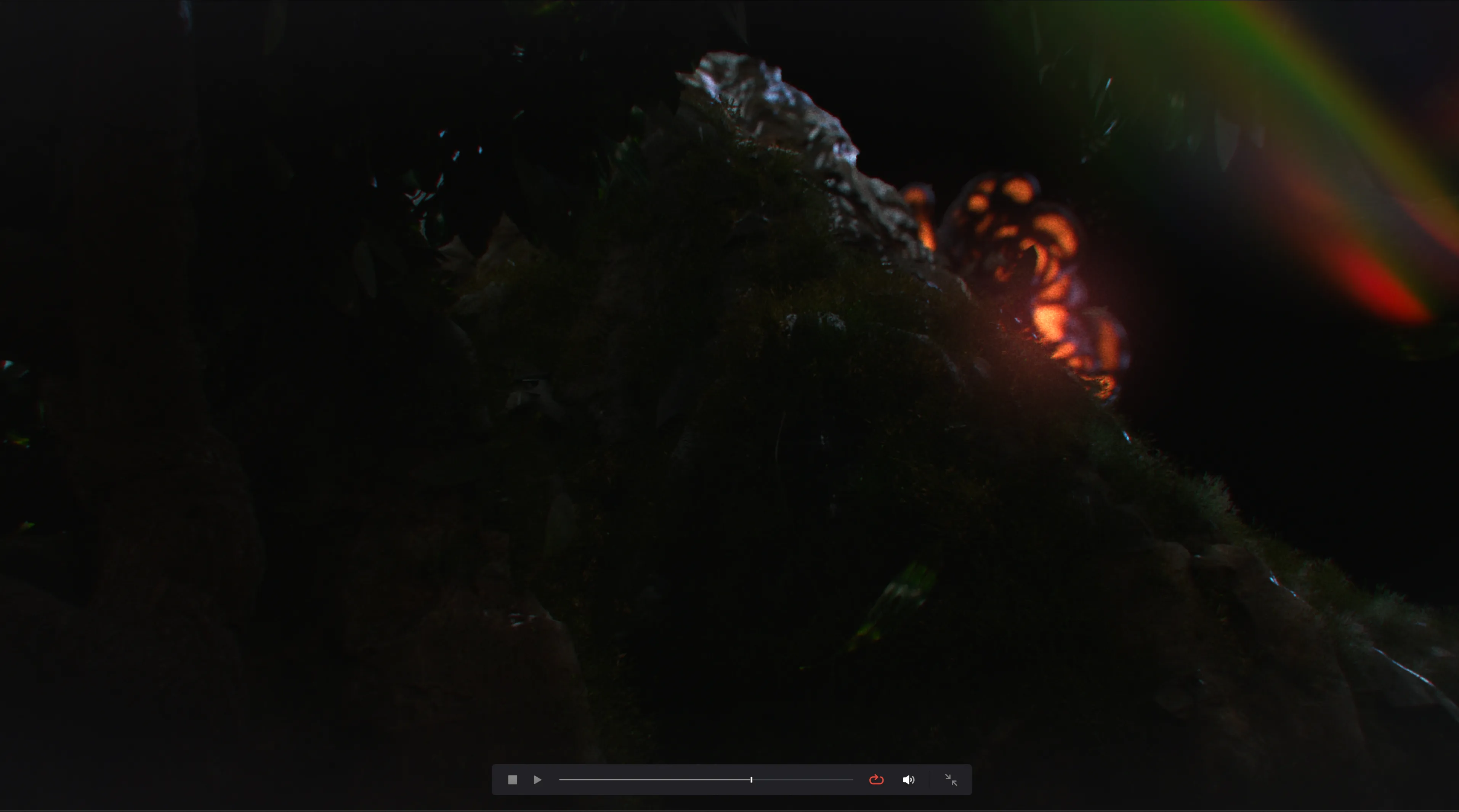
The slow nature of Karma was the perfect backdrop to work on a shot that involved strong post processing. Tweaking lights in Karma as opposed to Cycles or Redshift truly leaves a lot to be desired, a problem exacerbated by the amount of scattered objects within my scene. But! With careful planning and a minimal use of lights, I was able to fabricate a shot that matched my references whilst enabling me to explore non destructive post processing within Davinci Resolve.
To further enhance the idea of density whilst using minimal lights, textures were used on the “moon” lightsource to further give the frame some range / noise between the highlights and shadows. My influence for lighting came not only from my on hand references, but also from the works of John Carpenter, Stuart Gordon, and Rod Serling. Their intense use of color, fog, rim lighting, and lens flares all played a major role in setting up my approach to light composition and its subsequent post production.
Linear Export
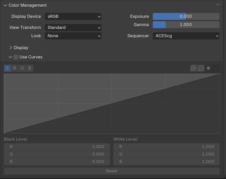
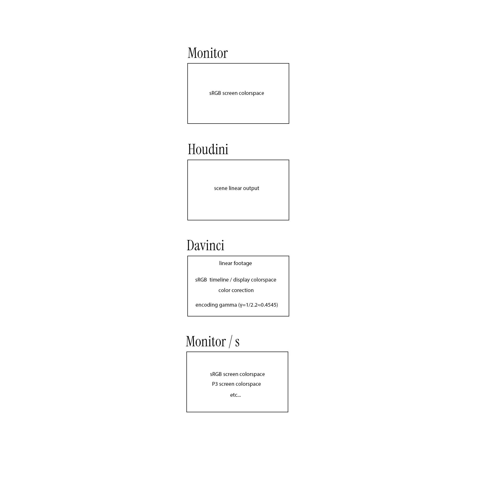
With the scene all set up, it came time to investigate the most appropriate way to manipulate an image, making sure it’s compatible with a wide range of screens. My work is primarily shared across social media, therefore I have no control of how a viewer may perceive my work and on what device. It is imperative that my colors are manipulated with the least amount of implicit data or distortion, and stored in a manner that is compatible with most displays. The first step in preserving the authored image came from rendering a linear ACEScg sequence stored within the EXR format. One can think of rendering a linear image as preserving the true tonality of your scene. Although our target colorspace is sRGB, working and rendering with ACEScg (a wide gamut colorspace designed for film production) ensures that our master image behaves in a predictable manner. Your display or target colorspace is still very integral as the de facto standard for what your footage should look like. Most consumer monitors will be 8 to 10 bit sRGB monitors, with the exception of Apple display devices, which use Display P3 as their colorspace standard. As stated before, we work with linear imagery to maintain consistency, with ACES being a mere container for our data. Being aware of your monitor specifications limits errors that can happen during the view transform process—a conversion that adapts your linear wide gamut values to your monitor’s limited range, more on this below. Karma in my case makes it hard to understand or find where to change my display device, with Blender making it quite clear. In the render properties, you are able to pick your display colorspace, scene colorspace, and view transform. Very descriptive names that make this article almost redundant. Another aspect in maintaining a predictable picture is to make sure your imported textures are also linearized. If your content creation tool of choice supports a PBR workflow, it will most definitely have a linear option right on the texture import node or their adjacent parameters. Although not explicitly stated within the PNG specification sheet, PNGs, and most definitely JPGs depending on their export parameters may have embedded colorspace metadata, therefore converting your footage will make sure any operations on your image will also behave predictably. Predictability in both cases means, when grading or augmenting your footage, mathematical operations such as blend modes or luminosity changes happen in a linear fashion, with the power function of encoded images causing such operations to over saturate or destroy details in your highlights, midtones, and shadows.
ACES as a color encoding system is supported in most programs, and its configuration file is often included within many 3D rendering packages, allowing you to use the same color profile across your editing suite. Although this specific project was done using Houdini and Davinci resolve, I always use the Blender OCIO configuration file to maintain consistency across my pipeline. You can find your Blender configuration file under:
“Blender Foundation\Blender (version No)\(version No)\datafiles\colormanagement\ocio.config”.
When it comes to the most appropriate way to store a linear sequence of images—according to the PNG specification document, this format can function as a lossless 16 bit (integer) per channel host for your data, making it a very suitable alternative to JPG / JPEGs. I bring this up because this was my file format of choice before discovering the EXR format. Therefore, this process will “work” should you choose to stick with PNGs as your format of choice. However, the EXR format is a far more versatile storage option with little to no drawbacks. EXR images store up to 32 bits of floating point values per channel, making it a true high dynamic range file format, with multiple compression algorithms that can help you store all this additional data in the same footprint as a PNG. Storing your data in a half float container of 16 bits per channel is more than enough, and is typical for most workflows, especially if file size is a concern. Although not explicitly stated in the PNG specification sheet, as mentioned before some programs may export your PNG image or sequence with a predetermined colorspace and power function, which adds additional steps to your workflow. The integer approach to bit storage also discards much of your luminance data, not making it suitable for high dynamic range workflows. Previewing EXR images may not be as simple as opening your PNG files with whatever image viewer is shipped with your computer, but DJV is a lightweight program that can allow you to preview your image or sequence, and any other AOVs or utilities you may have rendered. EXRs in combination with ACEScg, allows for a smooth transition of data from your desired render engine to your post production software of choice.
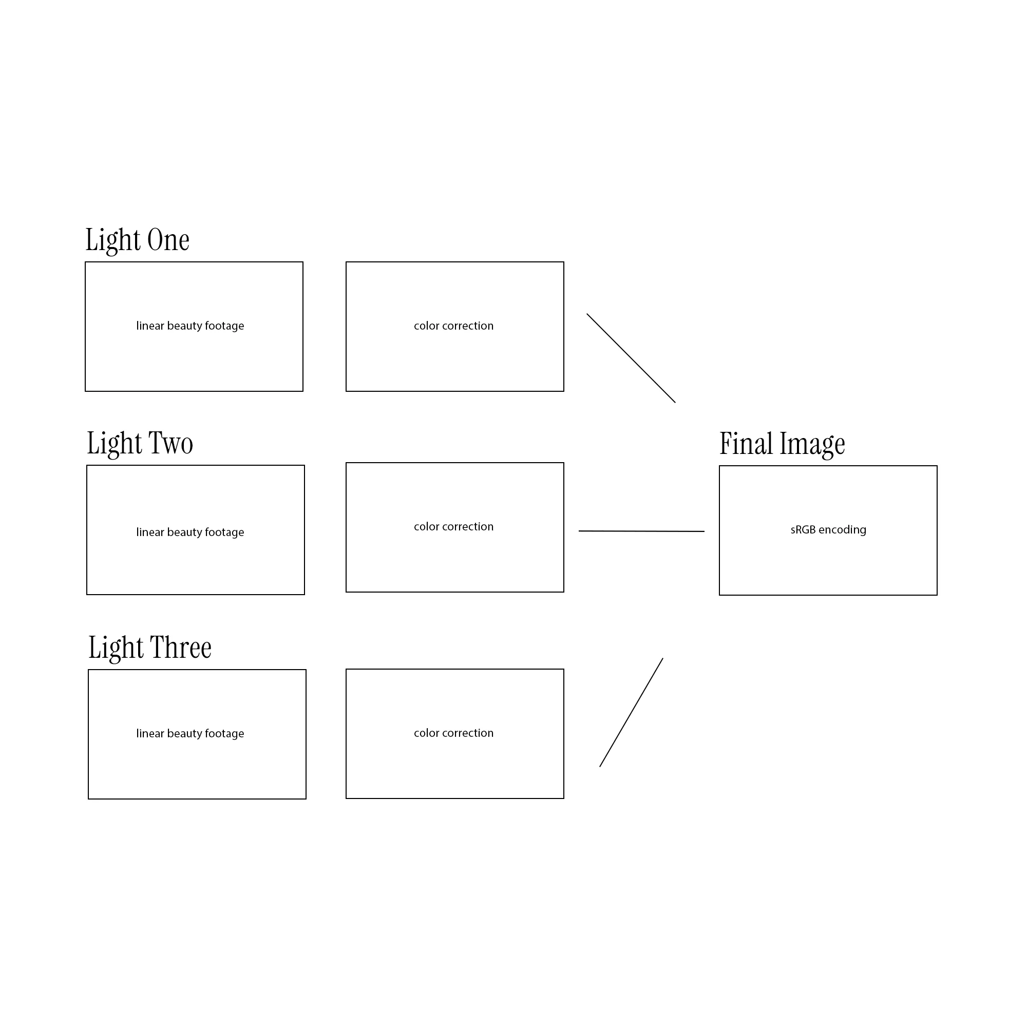
Should you not, as an artist, be interested in working with AOVs or utilities, i.e. (depth buffer, cryptomates), EXRs should still be a part of your workflow, as a way to preserve as much of the rendered image as possible. One can also render per light splits of your beauty alone, allowing you to have full control over your lighting in post. This can be very useful in cases where alternatives to the color or brightness of a specific light is requested.
This brings us to a very important part of this workflow. Knowing the differences between color spaces, transfer functions and tone mapping. These operations are very important when working with linear images, but can be easily misconstrued. Intimate knowledge of such nuances allows for a truly agnostic approach to working with images no matter the program or display, which is the intended side effect of this document. Tone mapping or view transforms primarily refers to the normalization (0 - ∞, to 0 -1) of luminosity values in accordance to your display’s peak brightness, which has a direct effect on the chromaticity of an image. Colorspace transforms, primarily focus on remapping your image from one chromaticity diagram to the other (ACEScg to sRGB), which also has an effect on the luminosity of your image. Whilst transfer functions, often known as gamma encoding reallocate bit information in response to the non-linear way in which humans perceive light, optimizing for precision in shadows where our eyes are most sensitive. These concepts in tandem with the historical legacy of CRT display curves are what primarily drive confusion when it comes to comprehending colorspaces. The beautiful thing is, these operations can be done as one step, limiting the amount of confusion that can happen when converting your footage. It is important to understand what each process does, because video tutorials may confuse you, as some artists may split these transformations at different points of their workflow with little to no explanation. I will explain my approach to avoiding such headaches in the subsequent paragraph. A question one might ask with all this newfound knowledge is: If I am working with an sRGB monitor, why render my work in the ACEScg colorspace? Why not keep the entire production in sRGB? So long as the rendered image is a linear sequence. The only appropriate way to answer this question is to test it for yourself, as both forms of image representation are just arbitrary calculations of luminosity and chromaticity. As stated before, render engines are inherently scene-linear with predictable operations that can be reproduced in other scene-linear programs, with your textures and the final output render being the main process in which you determine what colorspace to adhere to. I personally choose to work with the wider gamut of ACES to preserve as much of the color information as possible. This may not be as important when targeting one output display, but working and rendering in the widest gamut possible even if not visible on your display now, may prove beneficial when you have the opportunity to view your work on a professional monitor.
Post Processing
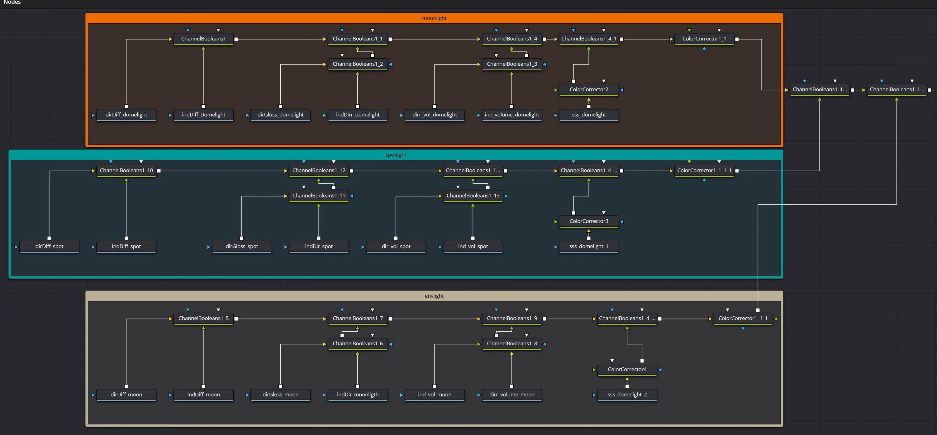
Finally! In Davinci Resolve, I imported my image sequence, split all the AOVs per light, before beginning my editing process. From the tutorials I have seen, a lot of editors will place a gamut node before the media out in order to convert / match their footage with the display colorspace. I opted to leave my footage completely linear within the Fusion context of Davinci and apply an sRGB LUT to my viewer. I did this for the sake of minimizing mistakes when applying mathematical transformations to the rendered sequence. This step is very important because upon importing your footage into Nuke or Davinci, your linear footage will appear darker than what was initially rendered. This is because your raw or scene-linear footage does not have any of the transfer functions discussed above applied to it, making it truly flexible imagery that can be adapted to a number of target output displays. Applying the LUT to the viewer (the same LUT used within your 3D package) and not the footage, gives us the added confidence that my footage is indeed completely scene-referred.
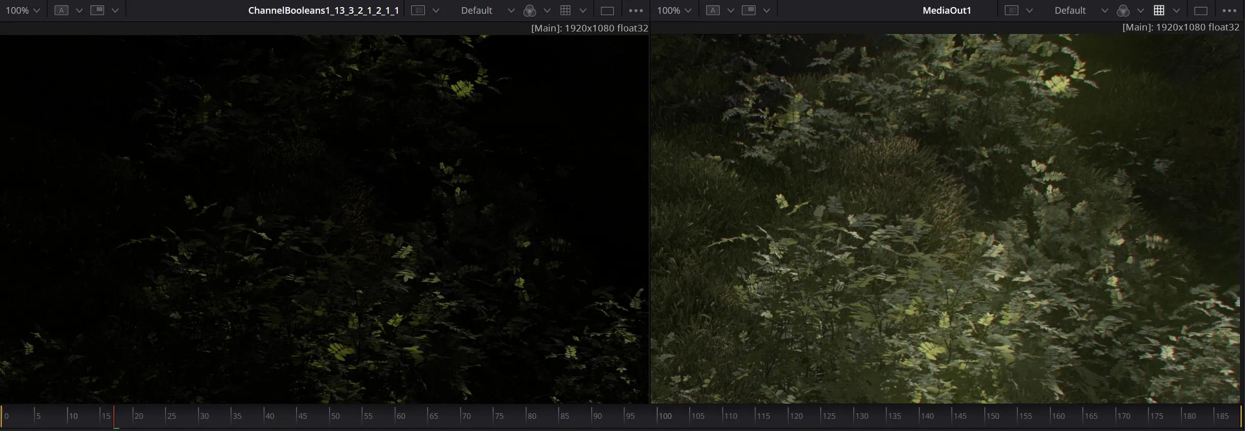
I remind you once more dear reader, the least amount of operations on your footage, the better. In Davinci’s Fusion context, I focused on adjusting the image’s luminosity using colorspace agnostic operations. This meant any changes I made could theoretically be replicated in Houdini or Blender, should I choose to go back and apply said changes to my scenes. Luminosity values were changed using the gain parameter of a color-correct node, a multiplicative operation. I also took this opportunity to use the z-buffer in creating depth of field, a procedure that would take considerably longer to do with Karma. To reiterate, there is no need for a colorspace transform within the Fusion context, because your changes within fusion should be technical and scene-referred (examples of such operations given above), rather than creative interpretations of your scene. With the sRGB LUT applied to your viewer, the footage should match exactly to what you exported from Blender or Houdini. If you were to change the chromaticity of your lights with an HSV slider in the fusion context, upon returning to Houdini with the same HSV values, your augmentation should render the same.
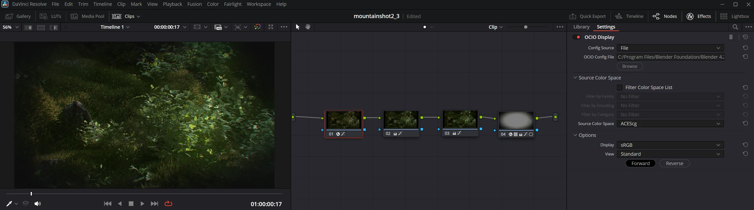
Finally, within the color context of Davinci, did I add colorspace and tone mapping transforms to my image, this is all done with the OCIO display setting. This was done because the color context of Davinci Resolve is where stylistic liberties will be taken, as it is the final step within the editing process, with operations that will not be replicated or rolled back into Houdini or whatever 3D package of your choice. The care and attention paid within Houdini and the Fusion context was done in order to allow for complete freedom within the color grading context, allowing us to grade our tone mapped high dynamic sequence however we would like so long as it looks good on our target sRGB display/s.
In understanding this process as an editor, you should be free to do as you wish to reach your stylistic vision. Following this process should not limit your artistic vision, but rather supplement said vision. You are free to break these rules so long as you have some context of what is happening.
Building a new foundation for working with color was not an easy task, but each subsequent render reinforced my understanding of the digital image at a fundamental level. Between splitting the image per light, AOVs, compositing and color correction, there is a lot to keep track of in delivering a final undistorted image. But in sticking with the process, and doing a lot more research into the computational representation of color and light, the additional control over the final image did mitigate many instances in which I would return to Blender or Houdini to re-render a sequence. I look forward to learning more about digital color and perhaps analyzing its cultural influences in future publications. Much of the online discussion about tone mapping and colorspaces refers to the process in its most technical manner. I hope in writing about my overall workflow, I can help other artists bridge the gap between their technical understanding of the process and how to implement it within their creative workflows. A list of resources will also be aggregated below to help facilitate your own understanding of the subject. Good luck and happy rendering.
References
What-every-coder-should-know-about-gamma
Color management
Academy Color Encoding System
Gamma correction
R-REC-BT.2100
PNG Specification Documentation
Gamma
ACES offical website
Video Tech Explained youtube channel
Understanding Gamma
Gamma Correction OpenGL
Why Do Images Appear Darker on Some Displays?